This post is also available in:
 Français (French)
Dear CEOs, your application is up to date! In this article, we invite you to discover the new features that come with it.
The interactive map
Available in BETA version for several weeks, the interactive map is now accessible to all.
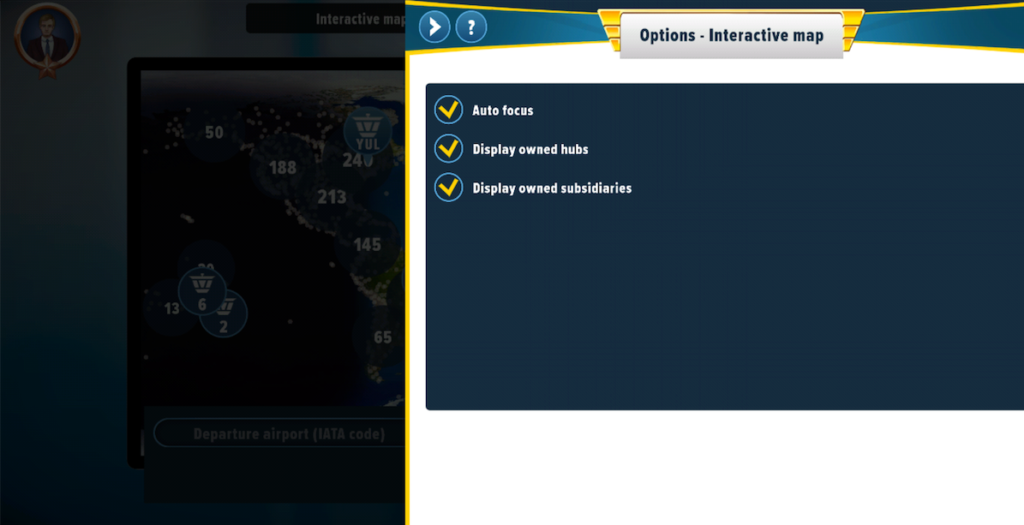
In its final version, the interactive map has a panel of parameters to increase your browsing comfort. To access them, tap the Interactive Map box at the top of your screen. You can:
- Activate the Auto Focus, which allows you to automatically zoom in on the airports you select.
- Display owned hubs, which allows you to view and select all the airports in your network without having to zoom in on them.
- Display owned subsidiaries, which allows you to view and select all the affiliates of your network without having to zoom in on them.

But that’s not all: additional information about routes have also been added.

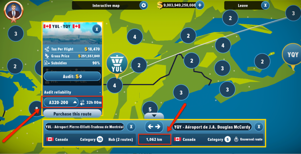
On the one hand, the total distance in km between two selected airports is shown in the center of the navigation bar.
On the other hand, in the presentation box of a route, you now benefit from a Reference Aircraft filter. Simply press the filter to open a drop-down list containing all aircraft compatible with the route. Once the aircraft is selected, the round trip flight time for the selected aircraft is displayed to the right of the filter.
More detailed information
About gameplay comfort, new notifications have been created to inform you when one or more Checks are completed and can be confirmed, and when a loan can be confirmed.
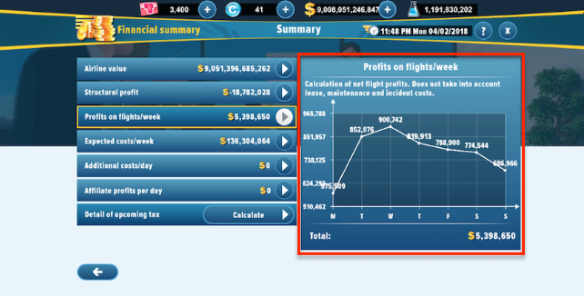
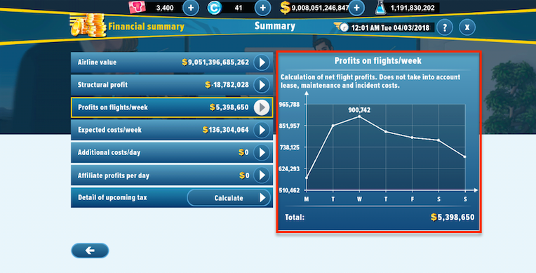
Furthermore, in your Financial Summary, you can choose to show or hide the figures of your three charts (Structural Profit, Profits on flights/week, Additional costs/day) by simply pressing on them.


Bugs correction
- When purchasing a hub, its statistics now appear correctly in the Route Creation menu.
- When a timeout occurs during initial loading, the loading bar no longer gets stuck at 92%.
- On Android devices, the “back” action now works correctly when an error occurs in the Shop.
- Interactive map items no longer display under the header at the top of the screen.
- On Android devices, entering login credentials is more convenient (the “back” action no longer do carriage return but hide the keyboard for example).
- Research waiting times are now expressed in real values, not rounded.
- When an ad is viewed to reduce the waiting time for an item in the Delivery List, this is now taken into account when sending the confirmation notification (there is no longer a time lag between the end of the waiting time and the notification sending).
